Global warming has long been noticeable, no longer only in rare events, but is rapidly developing into a threat to people and nature.
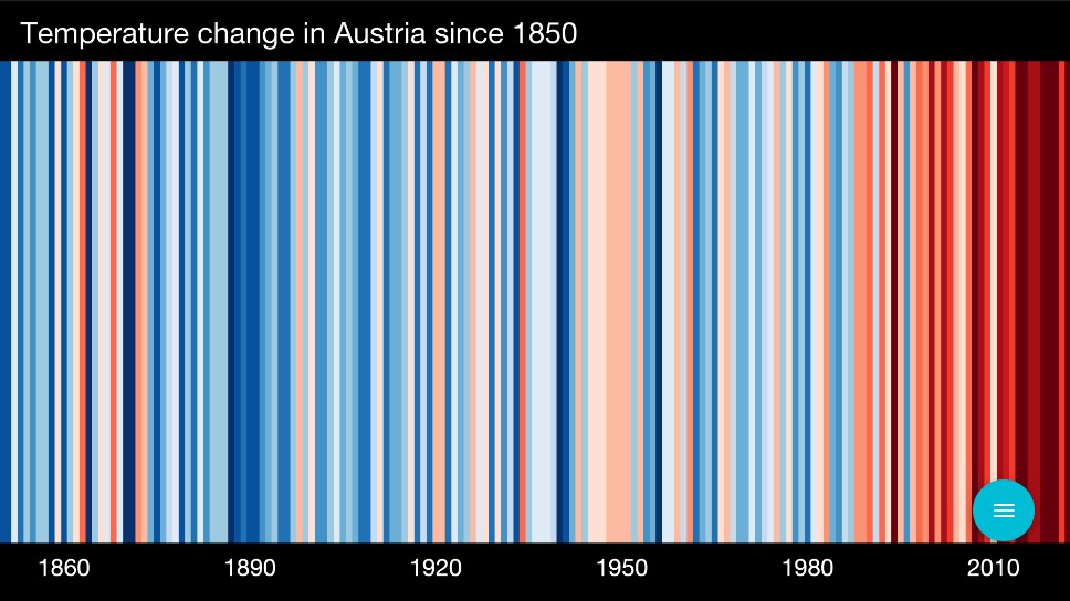
Climate development in Austria since 1850
Each stripe represents the average temperature per year from 1850 to the end of 2022. What immediately catches the eye: the drastic warming in recent years. The stripes change from blue to mostly red, again highlighting the increase in temperature.
Under #Showyourstripes, data from all over the world is collected and presented visually.
The annual average temperature is visualised in stripes with the data coming from weather services and the Berkeley Earth measurement dataset. For each country, the average temperature in the period 1971-2000 is set as the boundary between blue and red colours.
Source: ShowYourStripes